 After experiencing the CAT 2010 practice demo test released by Prometric, all of you must have found features you liked or found disappointing. We got Aditya Dipankar, a student of MDes (Information & Interface Design) 2009-11 at the National Institute of Design (NID), Bangalore to look up the practice test and identify pain points and suggest improvements in the interface.
"The interface looks as if it was designed for the lowest common denominator of test-takers in terms of their comfort with computers. Overall, the interface is alright. But there are some minor irritants and obvious improvements in usability that the interface lacks," says Aditya. Following is an edited compilation of the improvements suggested by Aditya. Most of the suggestions are from a design, usability and ease of use perspective.
Needs a help screen during the exam
There are a lot of buttons and features in the test to aid the test-taker. But the only aid provided to learn these controls is the tutorial that appears before the exam. The tutorial has a lot of information explained at one go. The assumption seems to be that all test-takers will easily learn all that information at one go and know how to implement it immediately on the actual exam screen.
Some kind of a ready-at-hand help would be nice to those who are uncomfortable with the format. The feature we are talking about would be a button titled 'Help' somewhere on the top-right of the test-screen and upon clicking on it, the computer would show a snapshot of the screen with callouts describing the function of each button. Upon clicking some sort of a 'Go Back to the Test' button, the screen would return to the test mode.
Review screen breaks sequence
If you are taking the test in the sequential order of questions and choose to go to the Review screen in between for whatever purpose, or because it somehow is a step in your strategy, there is no 'Back' button to take you back to the question you were attempting last. So you pretty much have to remember the question number that you were attempting before you jumped to the Review screen.
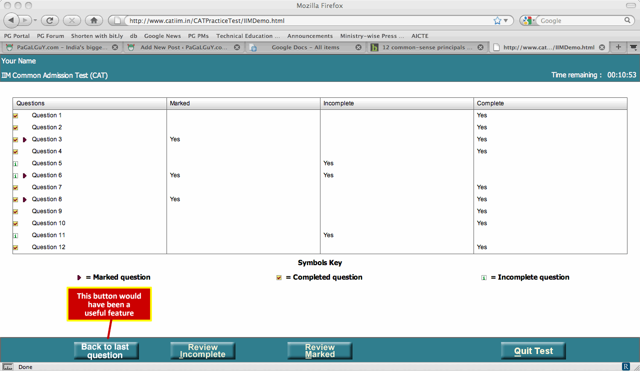
Most people will expect a 'Back' button there and upon not finding it, guess the question number they were on to resume taking the test. Sometimes, this guess might be wrong and it might take you to the wrong question and throw you off-track, wasting precious time in the process.
Although access to the Review Screen is provided throughout the test, the Review Screen itself has been designed for use only at the end of the test.
Better quality graphs and diagrams
We really hope that the quality of the graphs and diagrams in the test is better than the one given in the Practice Test. The lines are faint and depending on the luminosity of different monitor screens, often invisible. The choice of font is also totally wrong (the Arial Narrow on the vertical text on the Y axis is so closely spaced that it's illegible).

This is a test of aptitude and not eyesight. We are not expecting dazzling graphics, but it doesn't really take much to create graphs with a minimum level of elegance.
All text on the screen looks the same
There is minimal or no work done on the interface's typography. All text is in more or less in the same typeface and size.
Information that the test-taker is going to read more frequently -- such as the Time Remaining, or the question number -- could have been in a larger size compared to other items on the green band on top, so that it aids the eye when the test-taker is trying to locate it and make the visual hierarchy of text more efficient.
Ambiguous hotkey support
The first letter of each of the buttons is underlined. Are those supposed to be hotkeys? If one can invoke those buttons by pressing the corresponding keyboard keys (instead of the mouse), it at least isn't functional in the demo practice test. If there is no intention of attaching hotkeys to the buttons, then the underlines should be removed.
Many MBA aspirants have a tendency to rationalise bad design in entrance tests as "part of the stress environment the examiner is trying to create in order to test whether you are a good manager". So most CAT takers will not really fret over the above flaws in the testing interface.
However, from a point of view of a consumer service being offered for a price paid, a quality testing experience is something Prometric owes test-takers and thoughtful design is a part of it.
Have you aced the CAT? Do you have tips that could help students improve their scores or stress-busting strategies to beat pre-CAT nerves? Send in your advice and experiences to getahead@rediff.co.in with the subject 'My CAT tips' and we'll publish your strategies right here on rediff.com.