 | « Back to article | Print this article |
5 media players better than the iPod, well almost
Let's begin by setting the record straight. This is not an article prejudiced against Apple products, or one that indulges in the sport of Apple-bashing (admittedly a favourite pastime of several tech bloggers). There are some facts that no one can deny... such as the fact that Apple Inc single-handedly brought about the MP3 player revolution.
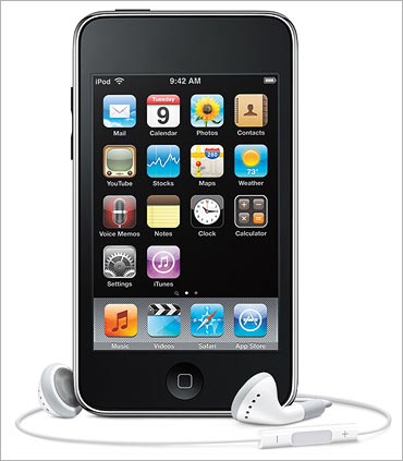
Over the years, as processing power and storage capacities grew rapidly with advancements in portable technology, Apple continued to evolve its design, adding video playback, WiFi capabilities, and a touchscreen, culminating in the current peak of its design, the iPod Touch.
Currently in its third generation, this device too has all the hallmarks of an Apple product -- great looks and an even better interface.
The third-generation iPod Touch has such advanced technology that when you take into account its superior internet browser and a vast library of 15,0000+ applications that you can download (several of them for free), it becomes less a PMP and more a pocket computer. And therein lies the problem.
In its drive to make the iPod Touch the jack-of-all-trades, Apple seems to have forgotten that for many people, a portable music player is mostly about the music. This is illustrated by the omission of certain features that most would consider as integral to the music experience such as the lack of an FM radio.
Even though users might have thousands of songs in their collection, a significant number would also like to listen to their local channels from time to time. But no, Apple wants you to pay an extra Rs 3,500 for its FM radio accessory. This is clearly a deliberate act by the corporate giant to steer you away from the latest music available on FM stations and instead buy them off its cash cow, the iTunes Store.
Then there's the lack of expandable storage options to accommodate your ever-expanding music collection -- in layman terms, the lack of an SD card slot. You're limited to the storage that comes with the player, and what do you do when some years later, you run out of space? Why, buy the latest generation iPod with extended storage space, of course!
In the meantime, all your songs have to enter and exit the player through its software, the iTunes Player. Meaning, you're not given the freedom to simply drag-and-drop files from your computer via Windows Explorer, like most other PMPs allow. Nor can you use the player to store other files, say your office documents, which would have made for a handy backup device since most people always carry around their PMP.
In effect, any PC you plug the iPod Touch into must have iTunes installed for it to work -- an unnecessary software restriction. Buy the iPod, and you're immediately placed in a gilded cage.
While some would dismiss these as minor drawbacks in an otherwise excellent product, some other flaws cannot be so easily overlooked, since they form the core of the music experience.
I'm talking about the lack of high-quality FLAC audio support, which as any audiophile will tell you, is an absolute sacrilege. Even if you couldn't care less about FLAC, it is a well-known fact that the audio quality of the iPod is well below that of rival players, which even go to the extent of including audio enhancements to make up for what MP3 takes away. Not only does the iPod Touch not have these enhancements, its earphones, to put it mildly, suck.
If you think that flashing your iPod and sporting those distinctive white earphones on a flight makes you look 'cool', think again. There are a whole bunch of people who know their music and are giving you pitying glances. Upgrading to a decent set of earphones will cost you an extra Rs 2,000 or so.
Which brings us to the biggest flaw in the iPod Touch -- its price.
All those marketing dollars have to go somewhere, right? Not only are you paying extra for a product that places style above substance, you're going to have to spend even more if you want FM radio and good sound quality.
Meanwhile, Apple's contenders have been busy over the last few years, coming up with products that combine killer looks and performance to boot in an effort to combat its absolute dominance. We've picked the best five of these that give the iPod a run for its money, if not beat it soundly. If you're the kind of person who does not base her/his purchasing decisions solely on marketing hype and good looks, you'll find there's a whole other world of portable audio excellence awaiting you through the looking glass.
Read on to get the scoop on the best PMPs in the market...
Reader invite
Are you a gadget/gaming wizard? Would you like to review gadgets, games, the Internet, software technologies and the works for us? Mail us a sample of your writing. Write to gadgetsandgaming@rediffmail.com with the subject 'My Gadget/Gaming Review' and we will get in touch with you.
Creative ZEN X-Fi2: All about the music
The Creative ZEN X-Fi2 is, in every way, a complete counter to what the iPod Touch stands for, and what I spoke about in the preceding text. To put it simply, the X-Fi2 focuses on providing the best possible music experience at the (relatively) cheapest possible price, and does this exceptionally well.
Creative, up until a decade ago, completely dominated the PC audio industry with its SoundBlaster line of audio cards. The arrival of sound codecs integrated into the motherboard sounded the death knell for its products among the masses, but it is still numero uno when it comes to audiophile-grade sound.
The Singapore-based company leveraged its knowledge of audio hardware to introduce its ZEN series of PMPs, which has its own dedicated fanbase.
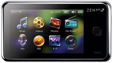
The X-Fi2 is Creative's latest offering in the PMP line, and its flagship product. It features a 3" TFT LCD resistive touchscreen that is 400 x 240 pixels, with a near-widescreen aspect ratio of 16:10. While nowhere near the quality of the iPod Touch, it is still capable of playing DVD-quality videos up to 640 x 480.
More importantly, unlike the iPod, it supports DivX, which is by far the most popular video codec across the internet. Drag-and-drop support means that transferring your music and video does not require any special software, and you can use it as a USB drive as well. A 16GB microSD slot takes care of future storage requirements, while the inbuilt speakers let you show off your music and videos to your buddies.
Coming to audio quality, the X-Fi2 is one of the best players out there. While FM radio and FLAC support are of course present, Creative has used its patented X-Fi technology to further enhance the audio, along with a Volume Restrict feature that automatically adjusts earphone volumes to levels considered safe for extended listening sessions. Couple this with the supplied premium EP-630 in-ear earphones, and you've got a great listening experience -- as Apple loves putting it -- 'right out of the box'.
It's not joyous all the way though. While most of the world has switched to capacitive touchscreens and the resultant fluid swipes of the fingers it allows, the X-Fi2's resistive screen means that you will need to literally jab at the screen to get it to do what you want. This lack of response has been bitterly complained about by X-Fi2 users, but what most do not know is that you can calibrate the screen to a sensitivity of your liking. This setting is hidden deep in the player's Options menu, but once you take the time to get it done, you'll see a marked improvement in responsiveness.
Secondly, while it does claim to support third-party apps a la iPod Touch, the reality is that the quality and quantity of apps, both built-in and external, are truly abysmal.
Another major issue pertinent to Indian users is the company's dodgy customer support.
While the Creative India website claims the device is available here, all the distributors I called said they didn't stock it at all and had no idea of the price. Your best option would be to buy it stateside, where it is available in capacities of 8GB, 16GB, 32GB, and 64GB for $110 ( Rs 5,500), $140 ( Rs 7,000), $200 ( Rs 10,000), and $280 ( Rs 14,000) respectively.
What We Like: If sound quality is your primary concern, and you're not willing to pay an arm and a leg for it, then nothing comes close to the Creative ZEN X-Fi2.
What We Dislike: The aptly named 'resistive' touchscreen might elicit some curses from you, at least until you get used to it. Moreover, the relatively small screen does make the competition look better when it comes to video playback.
Rating: 8/10
Specifications:
- Display: 3-inch TFT LCD touchscreen @ 400 x 240
- TV Out: 320p TV Out (cable sold separately)
- Video support: DivX, MPEG4, WMV9 (max 640 x 480)
- Audio support: MP3, WMA, WAV, AAC, FLAC
- Picture support: JPG, BMP
- Weight: 75g
- Dimensions: 4.02-inchx2.24-inchx0.46-inch
- Battery life: 25 hours audio, 5 hours video
- Charging method: USB
- Buttons: Power OnOff, Menu
- External storage: microSD up to 16GB
- Features: FM, Voice recording, Speakers, EP-630 In-Ear earphones, Accelerometer, Auto playlists, Audio enhancements
Website: in.creative.com
COWON V5: Feature overload
The first thing that strikes you about the COWON V5 is its huge screen. At 4.8-inches across, with a pixel size of 800 x 480 and 16:10 aspect ratio, it literally dwarfs the competition. But that's not all. A closer look at the specification sheet provided by the Korean gadget maker, and you'll be reeling with shock and awe.
If having such a beautiful screen wasn't enough, the player supports nearly every format you could ever want, including DivX, Xvid, WMV9, ASF, MPEG4, DAT (Video CD), and even 3GP for mobile video -- all up to a maximum resolution of 1280 x 720.
When you add support for subtitle files and multi-audio MKV (meaning, you can choose your audio track in case the video has multiple language tracks), then find out about its capability of sending out true HDMI video so you can attach it to a big-screen TV, you'll think you've died and gone to gadget heaven. Not only that, you can even play these videos at variable speeds of 70 per cent to 150 per cent, as well as capture a frame while watching a movie; features no other player has. Wowzer!
The goodness doesn't end there.
On the audio side, the V5 has an equally impressive supported list of MP3, WMA, OGG, WAV, ASF, AAC, TTA, and MPC, as well as the lossless FLAC and APE (Monkey Audio -- yes, you read that right). It also supports displaying visualisations while the music plays, lyrics via the LDB format, as well as variable speed playback.
This generous format support policy spills over into the picture region too, with not just the usual JPG and BMP, but also PNG, TIFF, TXT (text documents), and even RAW, which will make amateur photography enthusiasts jump for joy. Moreover, you have complete freedom to directly copy media files off your PC, and the ability to expand the storage up to 32GB via an SD card slot means that you can carry your lifetime's worth of media wherever you go.
The device weighs in a little heavy at 197 g, but that's a small price to pay for that amazing screen.
On the quality front, the video playback is exceptional, and audio quality can be enhanced using the proprietary JetEffect and BBE+ effects. While the earphones are not as good as the X-Fi2's, they are certainly several notches above the iPod's and will satisfy most useRs This enjoyment can go on and on, thanks to the jaw-dropping battery life of 45 hours for audio and 10 hours for video -- unmatched by any other PMP in the market.
All in all, the V5 is a PMP enthusiast's wet dream. All this might lead you into thinking that the Koreans are all set to rule the world when it comes to PMPs. Such illusions however, are shattered into a million audio bits the moment you take a look at the user interface (UI).
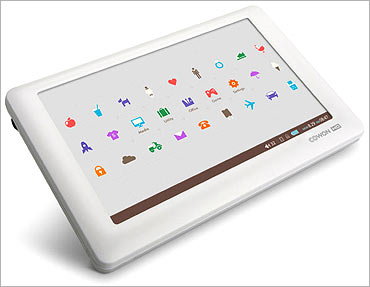
They say it is really hard to describe art; you can only understand it when you see it. Sadly, this applies to exceptionally bad art as well. I don't know if COWON was under the impression that the market for the V5 would exclusively be limited to 13-year-old Korean girls and their counterparts around the world, because the overdose of cuteness in the interface style, and its misguided theme of 'Life Is Love' certainly seems to point that way.
The screen is a smorgasbord of animated icons with bright and differing colours, making you think you just overdosed on LSD. Out of the 27(!) or so icons on the home screen, only five actually do anything -- the rest simply show a sun, clouds, a rocket taking off, and so on and so forth.
The huge number of icons means that each one is ridiculously small, and considering that the touchscreen is for some unfathomable reason of the resistive type (read: unresponsive), requires immense concentration to select with your fingernail. Obvious and most-used functions such as playing audio files require you to go deep into the menu to access.
The interface is made worse since it is based on Windows CE 6, an outdated OS that was never designed for touchscreens in the first place. This results in strange and random bugs that occasionally pop-up, indicating a lack of thorough testing on COWON's part.
Another example of terrible design is the PMP's Now Playing screen. A large part of the real estate is taken up by the progress bar, represented by the figure of a toilet-door male sign running towards a toilet-door female sign. On the other hand, functions that are actually of use, such as the Back button, playlist management, and others, are made minuscule and hard to select. Someone needs to shoot that designer.
It's a crying shame that such an amazingly feature-rich player had to be let down by such a frustrating UI. Then there's the price. At Rs 15,500, Rs 16,500 and Rs 21,500 for the 8GB, 16GB, and 32GB versions, the V5 is quite a bit costlier than even the iPod Touch. While the feature overload and screen might justify this price, the overall product certainly does not. However, if COWON does somehow manage to rectify its mistakes with future firmware upgrades and product revisions, then the search for the ultimate PMP has ended.
What We Like: A great array of supported file formats, solid features, playback quality, and that gigantic 4.8-inch screen make this player a perfect example of what any self-respecting PMP should offer the user: quality and choice. Buy it...
What We Dislike: ...but only if you have the patience and forgiving nature to deal with its singularly frustrating UI, otherwise it will make you want to catch the first flight to Seoul to burn down the company's HQ. And oh, it doesn't have FM radio.
Rating: 6/10
Specifications:
- Display: 4.8-inch TFT LCD touchscreen @ 800 x 480
- TV out: HDMIComposite out (cable sold separately)
- Video support: AVI (DivX 345 + Xvid), WMV 987, ASF, MPEG4, DAT, 3GP, MPEG1 (max 1280 x 720) with subtitles, variable playback speed, multi-audio files (MKVAVI), screen capture
- Audio support: MP3, WMA, OGG, WAV, ASF, AAC, FLAC, TTA (True Audio), APE (Monkey Audio), MPC (MusePack), WAV, variable playback speed, visualisation and lyrics (LDB)
- Picture support: JPG, BMP, PNG, TIFF, RAW, TXT
- Weight: 197g
- Dimensions: 5.04-inchx3.23-inchx0.62-inch
- Battery life: 45 hours audio, 10 hours video
- Charging method: AC adaptor
- Buttons: PowerHold, Volume
- External storage: SD card up to 32GB
- Features: Voice recording, Speakers, Audio enhancements
Website: www.cowonindia.in
Microsoft Zune HD: The empire strikes back
Microsoft and Apple have traditionally been rivals for a long time now, starting right from the mid-80s when their respective operating systems fought to capture the market. However, this rivalry could only be called nominal, since MS quickly raced ahead to an 80 per cent share with its Windows OS, leaving a measly 5 per cent in Apple's hands. Of course, the latter went on to capture the PMP market, with Microsoft, as is its wont, being a late entrant into the scene -- just like the browser wars of the mid-90s against Netscape Navigator. When MS finally woke up and decided to plunge in with its own offering called the Zune, it did so with little thought.
The original Zune was built (and looked like) a brick, and though it had decent features, the overall package just wasn't appealing enough to catch the user's fancy. As a result, it too was stuck with a limited fanbase, mostly comprising of Apple-hateRs
Not any more though. Around a year ago MS started leaking info about its latest generation Zune, which would have HD capabilities and technology to rival the iPod. Not only that, the experience would extend into the online space as well, somewhat along the lines of the iTunes Store. When the product was finally launched, it did live up to the hype, but in typical high-handed MS fashion, betrayed old fans of the player by making the online Zune service inaccessible to the older versions of the PMP.
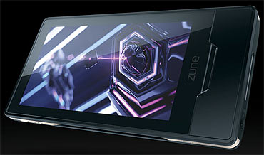
Back to the present the best way of describing the Zune HD is as 'an iPod clone with a twist'. In many ways, it's a lot like Apple's product, but done the 'Microsoft Way'. Take the looks for example. No longer uncool and square, the Zune HD has an amazing visual appeal to it, so much so that if that's all you're looking for in a player, you should stop reading right now and buy one. Unlike the iPod Touch's feminine curves and glossy 'fingerprint magnet' body, the Zune HD has more of an 'industrial' style to it -- it looks and feels solid. Four prominent screws on the back reinforce this theme. Even then, it manages to be the lightest PMP of the lot, tipping the scales at 74 g as opposed to 115 g for the iPod Touch.
The 3.3-inch LCD touchscreen is exceptional, like the iPod's. It's likewise just as responsive. The 'twist' comes in the form of its OLED (Organic Light Emitting Diode) nature. The newest kid on the block, OLED has the advantage of having much better contrast levels, hence better quality. On the flipside, its nature makes it nearly impossible to view in direct sunlight. Whether you prefer OLED to TFT depends solely on where you use it most.
The UI, like Apple's, is extremely friendly. Again, the twist is in the way it is implemented. While the iPod features rows of icons, the Zune uses attractive, large text in a list-based format. It is also more 'edgy', in the sense that the large text sometimes rolls off the screen if you zoom in. Mind you, this is a deliberate design decision.
It doesn't get cut off enough to make it unreadable; just enough to make it look like nothing you've seen before. It's hard to describe it further, save by saying that it's just as fluid as the iPod's and just as easy to learn. One nifty little feature is that though the Zune HD does not have an external volume button, performing common tasks like changing the volume or skipping to the next track involve pressing its Media button on the side, then simply swiping your finger across the screen -- vertically to change the volume, and horizontally to go change the track. With very little practice, all this can be done without even looking at the player, which is where it scores over the iPod Touch.
Moving on to the format support, the Zune is just like the iPod. It features support for only the most common file formats, including Microsoft's Windows Media Player codecs. FLAC and DivX are conspicuous by their absence, as is the lack of an expandable storage option. However, it is able to play HD content (720p), and though of course its screen is not HD-capable, it can output full 720p video to your TV via its dock, which of course has to be purchased separately for a cool $90 ( Rs 4,500). All hail the evil corporations.
To its credit, once you do fork out the dough, you'll have no complaints about the dock's performance and quality. Finally, while the Zune HD does have FM support unlike the iPod Touch, it lacks speakers as well as voice recording, both of which are present on the latter. As far as quality goes, the Zune scores significantly over the iPod, since both its output quality as well as the bundled earphones are leagues ahead of Apple's PMP.
On the software side, just as Apple handcuffs you with its iTunes, the Zune HD has its own Zune Media Player.
Unfortunately, while iTunes is available for Windows, the Zune Media Player does not exist outside Microsoft's OS. Likewise, while iTunes is all about purchasing the music that you like for $1 ( Rs 50) a piece, the Zune Pass service allows you to sample and keep unlimited music, as long as you pay $15 ( Rs 750) every month.
You also get to keep 10 songs per month, and they won't get deleted even after your membership expires. Which service you prefer depends solely on whether you like to purchase or rent your music.
Nevertheless, since the Zune Pass isn't available outside the US while Apple's iTunes Store is available worldwide, the latter scores a point for Indian consumeRs Lastly, while both PMPs support third-party apps, the Zune has just started out in this field and is thus no match for Apple's vast library. However, you can rest assured that the software giant is furiously working to change the status quo, so it's only fair to give it a few more months to see how things pan out on that front.
Who then, should buy the Zune HD? Simple...
If you belong to the camp that prefers gadgets with flaunt value, then the Zune is for you. It's just as sexy as the iPod, and since it is far rarer here, it's guaranteed to make heads turn. The facts that it is lighter, has much better video quality, slightly better audio quality, and yet costs less are factors that tilt the balance in its favour.
The Zune HD is currently sold only in the US, but you can get it from Amazon.com for $200 ( Rs 10,000), $270 ( Rs 13,500), and $350 ( Rs 17,500) for the 16GB, 32GB, and 64GB versions. The latter will only be launched in end-August, but pre-orders are being accepted.
If you manage to snag the 64GB version, you've got as good a chick magnet on your hands as can be found in the gadget world.
Meanwhile, on the Internet, ever since the Zune HD's launch, epic flame wars have raged between Apple and Microsoft fanboys, since the latter finally have a challenger that bravely stands up to the champ. There can be only one!
What We Like: Stunning looks, coupled with a seductive OLED screen that plays at a true widescreen format (16:9). Looking at Microsoft's marketing clout, the Zune HD is currently the only serious challenger to the iPod Touch's dominance of the market.
What We Dislike: This PMP is nothing but the iPod in a different skin. It has the same software restriction, limited audio and video format support, and lack of basic features such as expandable storage and speakeRs Choosing between the Zune HD and iPod Touch is literally like choosing between the lesser of two evils.
Rating: 7/10
Specifications:
- Display: 3.3-inch OLED LCD multi-touch touchscreen @ 480 x 272
- TV out: HDMIComposite out (dock sold separately)
- Video support: WMV, MP4 (max 1280 x 720)
- Audio support: WMA, AAC, M4A, MP3
- Picture support: JPG
- Weight: 74g
- Dimensions: 4.02-inch x 2.07-inch x 0.35-inch
- Battery life: 33 hours audio, 8.5 hours video
- Charging method: USB
- Buttons: PowerSleep, Media, Home
- Features: FM (HD Radio only in US), Zune software required, Accelerometer, Wi-Fi with browser, Auto Playlist
Website: www.zune.net/en-US (US site)
Got a favourite so far? Check out the other contenders first, on the next page...
Sony X Series Walkman: The underdog
Right up until the Zune HD came along to shake things around, Sony's latest X Series offering was being touted as the true challenger to the iPod. Coming from its long and distinguished line of Walkman music players, the format had evolved from the analogue tapes of the '90s to the sleek digital players of today. The X series, Sony's flagship offering in the PMP line, was first exhibited during CES 2009 (one of the planet's biggest tech expos) and had elicited rave reviews for its eye-catching looks and performance. When finally launched to critical acclaim, it came up against the Zune HD mere months later, which until then had been a closely guarded secret.
When the inevitable clash took place, the Zune ground the X Series into the dust with its massive hype, pushing Sony's product into the 'underdog' section -- and with justifiable reason too.
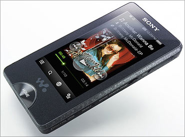
The X series Walkman sports a 3-inch touchscreen OLED with a resolution of 432 x 240 pixels. This being the first PMP to sport the fantastic OLED screen, it immediately caught the attention of the PMP world. While the pixel size indicates an aspect ratio that is wider than 16:9, the reality is sadly quite different. Due to its limited processing power, the X Series is only capable of playing videos at 320 x 240, which translates to a narrowscreen aspect of 4:3. Having such a potentially awesome screen and then not making full use of it is one of the biggest problems of this device.
Fortunately, there are no such compromises when it comes to the UI.
I'll say this right out -- the X Series has the best interface of all PMPs, period. While largely list-based like the Zune (that is, it doesn't use icons like the iPod Touch), it is far more minimalist, with no fancy touches.
More importantly, it is simple and elegant, like any good UI should be. It is essentially a more refined version of the Zune UI. As an example, while scrolling though a long list of songs, the X Series has an alphabetical bar at the top that lets you skip straight to songs beginning with that letter.
Small points like this are the hallmark of a mature, well-thought out design. All of your most-used functions are always available, and it'll take no more than a few seconds to learn how to use the UI effectively. Here's another example of the solid design.
While listening to a song, one of the buttons available along the bottom will take you directly to a YouTube.com search page containing all videos of the artiste you're listening to. This of course requires an active WiFi connection, but is a great way to extend your listening experience. Finally, apart from the touchscreen itself, the player has the complete set of hardware buttons, including PlayPause, ForwardBack, and Volume, all perfectly placed. In effect, you can fully control the PMP via both the hardware and touchscreen interfaces.
This is a great example of providing quality as well as choice.
Coming to the audio and video formats supported, the X series loses a few marks here. Along with the limited screen space for videos, you have a limited format support that recognizes only MPEG4 and WMV videos. On the audio side too, there is no support for FLAC. This omission is truly surprising, given that the audio quality of the X Series is the best of the lot, even beating the X-Fi2 in this respect! For a device to have audiophile-grade sound and then ignore the high-quality FLAC format that naturally goes with such performance is strange indeed.
Further enhancing the experience are Sony's sound enhancement features, including the ear-saving Volume Limiter. There's also a noise-cancelling feature, which works only with the supplied premium, high-quality earphones. This combination does a superb job of blocking out ambient noise to give you an exhilarating music quality.
Further adding to the party is the PMP's FM reception, which is also the best among the PMPs discussed here. Be aware though, that using noise-cancelling presents a serious drain on battery life, which is already on the lower side. While Sony claims 33 hours of playback, real-world battery tests conducted at sites like CNet.com report it is closer to 24 hours instead.
The X Series is a no-frills player, but this also extends to important features like expandable storage, speakers, TV out, and voice recording. On the bright side, 'no frills' also means no software is required to move files to the player. In fact, Sony's Media Manager software is so badly made, you're better off not going anywhere near it.
The X Series' stellar audio performance and unique looks make it stand out from the crowd. You can't really call it better or worse than the iPod Touch or Zune, just different.
The player, with its granite-like side texture (it's actually metal) and glitter-speckled back give it a solid look that the others just don't have. Balancing out all this magnificence though is its price, which can only be described as atrocious. Sony products have traditionally come at a premium, but asking $300 ( Rs 15,000) and $400 ( Rs 20,000) for the 16GB and 32GB versions is taking things too damn far.
Granted, this includes 100 free song downloads from Sony's online music service, and assuming a cost of $1 per song, comes to a value of $100, but I'd have liked it better if this offer was optional. Oh well.
What We Like: The best user interface and sound quality of all current PMPs. If sound quality is your number one concern, and you're willing to get it at any price, choose the X Series over the Creative ZEN X-Fi2. The fact that it looks beautiful is an added bonus.
What We Dislike: Pricing this product above the iPod Touch, while having none of the bells and whistles that Apple's products have, is a big mistake. The only way to eliminate Apple's hegemony is to offer a vastly superior product at a vastly inferior price. Sadly, Sony's got just one half of that equation right.
Rating: 8.5/10
Specifications:
- Display: 3-inch OLED touchscreen LED @ 432 x 240
- Video support: MPEG4, WMV
- Audio support: MP3, WMA, AAC, WAV
- Picture support: JPG
- Weight: 99.22g
- Dimensions: 3.88-inch x 2.13-inch x 0.41-inch
- Battery life: 33 hours audio, 9 hours video
- Charging method: USB
- Buttons: HomePower, Noise Cancelling OnOff, Volume, PlayPause, Forward, Back, Hold
- Features: FM, earphones with three sizes of silicone tips, WiFi, Audio Enhancements
Website: www.sony.com (US site)
ARCHOS 43 Vision: The French connection
ARCHOS has been around for some time now, and has established itself as a serious and quality player in the PMP market. It competed aggressively with Creative in the MP3 player space back in the late '90s, right up until the iPod came along and swept its rivals away. In recent months though, the company has been in the news for its ARCHOS 5 Internet Tablet, a top-drawer device with a fabulous 5" screen and fantastic media quality, and 320GB of storage space. However, since the ARCHOS 5 is more portable computer and less media player, it'd be unfair to compare it to the devices mentioned here, so instead I'll take up the ARCHOS 43 Vision, an honest-to-goodness PMP that's hot off the assembly line.
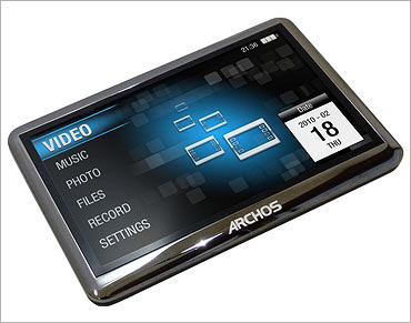
The 43 Vision has a queer way of being spelt. The device's logo is represented with a big '4' and a small '3 vision', but considering that it's French, we can let such idiosyncrasies pass as being par for the course.
In all other respects, it's a 'common sense' player that like the X-Fi2 and X Series, prefers to let its performance speak for itself. It carries a 4.3-inch TFT LCD screen with a resolution of 480 x 272 pixels, and an aspect ratio of 16:9, second only to the COWON V5.
It must be noted here though that since the Zune HD sports a similar pixel size in a smaller 3.3-inch screen, its pixel density, and hence quality, are superior to the 43 Vision's.
Comparing the 43 Vision to the X-Fi2 would make the most sense, since both are well-matched on several parameters. Interface-wise, both have simple UIs that are easy to catch, but the former's screen is far more responsive. On the topic of video formats, the X-Fi2 scores a point with its DivX support, which the 43 Vision lacks. However, the latter makes up for it by including FLV as well, which means you can play all those YouTube videos you've downloaded.
On the audio side, the 43 Vision trumps again by recognising the OGG and APE formats too, along with displaying lyrics using the LRC format. The story is repeated for pictures, with the 43 Vision's added support for GIFs, though this is admittedly a minor consideration.
When it comes to audio and earphones quality, the ARCHOS PMP does rank over both the Zune HD and iPod Touch, but is slightly inferior to both the X Series and the X-Fi2. The only audio enhancement available in the French player is a Sound Equaliser, which ensures that volume levels stay the same, even when you switch between songs recorded at different volume levels.
However, while Creative's and Sony's offerings are heavily tilted towards providing a fantastic audio experience, ARCHOS' product sacrifices some of that to offer more balanced, high-quality audio and video playback.
Since the ARCHOS 5 has taken on the mantle of the 'all-in-one' portable computer, the 43 Vision focuses solely on the PMP side of things, dropping all other features except for voice recording and speakers. However, it is difficult to understand why FM was given a miss too.
More examples of the player not taking advantage of the latest technology lie in its inferior battery life, which is a measly 18 hours for audio and 6 hours for video. How then, despite lacking all these features, it manages to weigh in at a lumbering 280 g is beyond me. This is four times as heavy as the Zune, and nearly 50 per cent heavier than the V5, which has a much bigger screen as well!
More French weirdness is manifested in the decision to make the player available in only an 8GB capacity. Thankfully, the up to 16GB microSD slot and freedom to drag-and-drop files make up for this somewhat. Perhaps higher capacity versions will be made available in the future. These are early days for the 43 Vision, as it was launched in May across France, while just making its presence felt in the UK at the end of June. Currently available for 100 ( Rs 8,000), this is priced significantly above the X-Fi2, but is partially justified by its far superior video performance.
What We Like: A well-balanced, high-quality player that offers good audio and video playback, while being reasonably priced. Meant for the discerning user who prefers substance over style.
What We Dislike: Far heavier than what current-generation PMPs should be, and with far less battery life as well. The added hindrance of just 8GB of storage leads to the suspicion that it might be using outdated technology.
Rating: 7.5/10
Specifications:
- Display: 4.3-inch TFT LCD touchscreen @ 480 x 272
- TV Out: Yes
- Video Support: MPEG4 AVI, WMV, FLV, MPG
- Audio Support: MP3, WMA, WAV, OGG, FLAC, APE, AAC, with lyrics (LRC)
- Picture Support: JPG, BMP, GIF
- Weight: 280g
- Dimensions: 4.41-inch x 2.87-inch x 0.39-inch
- Battery Life: 18 hours audio, 6 hours video
- Charging Method: USB
- Buttons: PowerHold, Home
- External Storage: microSD (max 16GB)
- Features: Voice Recording, Speakers, Sound equaliser
- Website: www.archos.com (UK site)
Conclusion
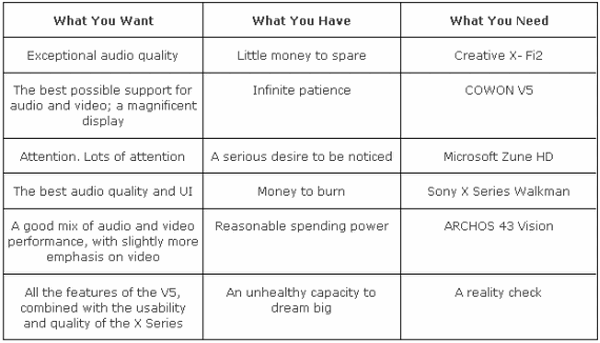
Here's a nice little table to sum things up. Choose wisely, little grasshopper!
