Got a big presentation to make to impress the right people? Here's what you need to keep in mind. Illustration: Uttam Ghosh
Whether you are studying or working, you would need to deliver presentations to other people in your organisation. For students, the presentations can be for academic projects delivered in the classroom, or industrial training presentations for evaluation purposes in front of the professors. Working professionals may need to deliver a sales pitch to a client, a monthly review presentation to the senior management, or a weekly target presentation for the team members.
In all these cases, it is important that you understand the importance of an effective presentation and know how to make a comprehensive yet short and interesting one.
So here are a few things which should be kept in mind while making a presentation:
Set an agenda: Before you get started with the presentation, clearly specify the topic of the presentation, and the key points which you will be discussing during the presentation. Present all this information on the first or second slide. Further, when the audience is listening to your presentation, they also deserve to know how much of it is remaining. So, either distribute handouts of the presentation before you get started, or ensure that you include the agenda of the presentation in the first few slides, and also before starting every item point on the agenda list.
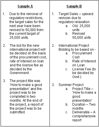
Use of bullets: Try to present the information in the form of bullet points so that the key points of your presentation are more clear and easy to remember. Have a look at the given examples:

In Sample A, the information is presented in the form of long sentences. It is not very comfortable to read such long sentences while looking at a presentation. Further, there is always a chance of missing out on an important part of the information while reading such a sentence. A better way to present such information is to use bullet points, as demonstrated in Sample B. Using bullet points makes the information easy to understand and remember.
Short sentences: Do not use sentences which occupy more than two lines of the slide. Try to break a long sentence or paragraph into smaller parts and write them as separate points.

Keep it short: A presentation should be made in such a manner that it can be delivered both in a concise format as well as in a detailed format according to the time availability. While for academic presentations, the time availability may not be a constraint, for corporate presentations and sales pitch presentations, the time available is usually not more than 10-15 minutes. Hence a presentation should be made keeping in mind that it can be fully delivered in around ten minutes.
Font size: The font size of the presentation should be large enough that it can be easily read by the person who is sitting farthest from the screen. At the same time, keep in mind that you don't use too many highlighted letters and capital letters, as too much of that makes the text unreadable.
Font style and colours: Except for the cases when a presentation is intended for kids or for an informal setting, the choice of the font style and font colour should be conservative. Font styles like Times New Roman, Palatino Linotype, Verdana, Arial and Tahoma etc can be used for formal presentations. Avoid fonts which are too bold, italic, comic or gothic, as they tend to reduce the seriousness of the matter.
Summary slide: After you are done with the presentation, summarise the key points so that the audience remembers the important points of the presentation. Try to limit the summary to a single slide with four to five bullet points.
Mayank Gupta is an IIM Kozhikode alumnus and handles business development at BodhiSutra. BodhiSutra (www.BodhiSutra.com) is an IIT-IIM alumni venture which specialises in employability skills training programmes for graduate and postgraduate students. BodhiSutra offers both domain-specific programmes and general employability skills training programmes for students and working professionals.


